Ratio sorting page
Purpose
Our team serves banks and credit unions by supplying keen analysis and timely advice. We do this in many ways across the firm, but our team focuses exclusively on the analysis of public data, such as balance sheets and income statements, and drills down from the basic numbers into a wealth of ratios.
Users of our software have numerous pages to review aspects of their business. They can review the health and risk-aversion of their assets under our Asset Quality tab, or jump over to Earnings for a breakdown of many relevant data points and ratios. These have been tailored by our team of professional analysts and advisors.
But every business is unique, and finds itself in unique circumstances. What if we enabled our clients to implement their own custom views into the data points and ratios that are most relevant for them at this time and place? And that’s what the Ratio Sorter project is all about.
⚠️
The project name was Ratio Sorter, but the tool itself was later rebranded to Data+.
Design
Beyond the desire to give more power to our clients and a laundry list of ratios to display, our team didn’t have a clear vision for what the interface should look like. This is great news for a developer like me, since it lets me design for both a clean architecture and a user-friendly experience.
Configuration
The ratio display was a known factor since we have many Excel-like tables throughout out site. The interface that took the most discussion and compromise was the configuration.
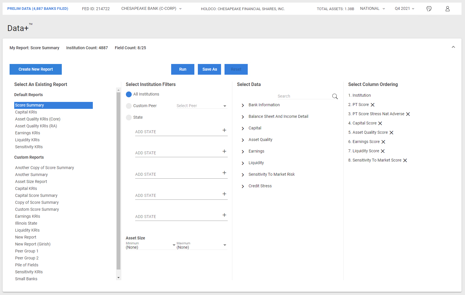
I advocated for a four-part configuration that kept each step in the process within it’s own boundaries. First the selection of a report, new or existing. Then a top-level filter of the included institutions. After that, a selection of the ratios and data points to display. And last, the order of those columns on the resulting table.
This strategy gave us two benefits.
First, it felt natural. A first-time user can move left-to-right and have a complete report without jumping between sections. We could have coded the project to go through each step, allowing the user to only see one screen at a time, but by putting all of the configuration options on one page we also gave our power users a better experience when they wanted to adjust one filter here, then a field there.
Second, it keeps clean area of concern. Each section is its own Angular component which is responsible only for the logic within that page. A parent component manages the shared data, but it doesn’t need to understand the specific implementation details of ordering vs. selecting data. As we made tweaks to different parts of the configuration, this separation made it simple to reason about where changes should be implemented and prevented bugs caused by confusing data flows.
Results
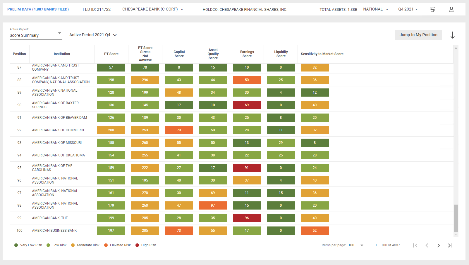
In the initial design all the results were shown on a single page. There are just under 5,000 banks in our system and, as you can imagine, the correlation of all those banks with a dozen or more ratios had some performance concerns. We were actively solving those when the team decided that they’d prefer to implement paging instead. This was a major hurdle to our existing design and required a complete rearchitecture of the way we retrieved data.
Consider: you have three thousand banks and fifteen ratios per bank. Now you want to see only the first one hundred. No problem, just take a slice of the whole. Want to go to the next one hundred? Take the next slice. Easy. Now you’re on the fifth page and you add three ratios. Our program chugs along adding that ratio to all the banks, then spits out the same slice with the new ratios. Finally, you sort the results by a ratio. To figure out what banks you should see, we’ll have to sort on all the banks, then show you a slice again. All of this can be done, but let me tell you, it’s a lot of processing for our client’s browsers.
In collaboration with our data team we landed on a solution. With our database expert’s help we’d implement a tricked-out stored procedure that would take filters and fields as arguments and spit out a paginated set of results. Only the results that we need to display, nothing more. Is it fast? Oh yeah, it’s cheetah fast.
Accolades
February 22nd, 2022 The boss of my boss: Alex got a “That’s so f#!@ing awesome” on today’s Data+ demo!
March 17th, 2022 My Boss: “Hey Everyone, the team just launched Data+, which is a new offering available to PT Score users. This a great new tool that is already receiving positive feedback from both our internal business partners and our clients. Alex worked iteratively with the PT score team to get out a very solid product! Congratulations Alex!
Highlights
Angular RxJS
Tools like RxJS don’t really make sense until you have data as complex as this project. It was an amazing learning opportunity and a huge win to use. Some of the best rules of thumb I discovered were to keep one subscription per resource, that smart components observe state over input, and to distinguish series and one time observables.